
How to Choose Colours That Flatter Your Figure
Here's a useful distinction that doesn't always get made clearly enough: there's the question of which colours suit your complexion — your skin tone, hair, and eyes — and there's the entirely separate question of how colour placement on the body affects the way your figure reads. Both matter. But they're different things, and confusing them leads to advice that sounds authoritative but doesn't actually help you get dressed.
This article is about three connected questions: how the placement of light and dark colours affects proportions, how undertone determines which colours flatter your complexion, and how your personal contrast level affects which combinations work. The empowering thing about understanding these principles is that they give you control — rather than following advice like "pear shapes should wear dark bottoms," you can understand why that advice exists, decide whether it applies to what you want to achieve, and make informed choices that reflect your own aesthetic.
Three things determine whether a colour flatters you: placement (light advances, dark recedes — use this to balance proportions), undertone (warm skin loves warm colours; cool skin loves cool ones), and contrast (high-contrast features can carry bold colour combinations; low-contrast features look best in tonal harmony). When you choose fabric for a handmade dress, hold it close to your face in natural light — your skin will tell you whether the colour is right.
How Light and Dark Colours Work on the Body
The most fundamental principle of colour and figure is this: light colours advance and dark colours recede.
This isn't a style opinion — it's a visual fact rooted in the physics of how the eye processes light. A light surface reflects more light toward the viewer, making it appear closer and larger. A dark surface absorbs more light, making it appear further away and smaller. Fashion has used this principle for centuries, and it remains one of the most reliable tools in a sewist's toolkit.
In practical terms:
- Light colours draw attention to and visually enlarge the area they cover. A white bodice makes the bust and upper body appear larger and more prominent. A pale skirt makes the hips and lower body appear wider. This isn't inherently good or bad — it depends on what you want to achieve.
- Dark colours minimise and recede. A dark skirt creates less visual emphasis on the hips. A dark bodice draws less attention to the bust.
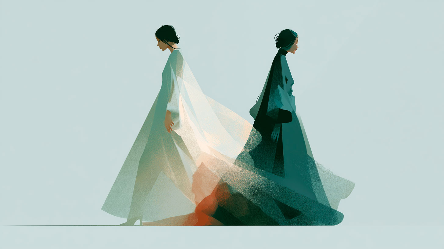
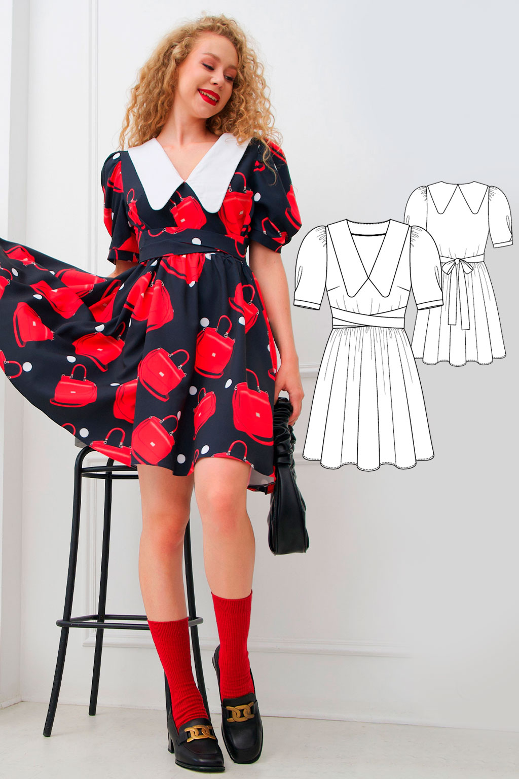
- Contrast between top and bottom creates a visual break. Light top + dark skirt (or vice versa) draws the eye to where the colours meet — typically the waist.
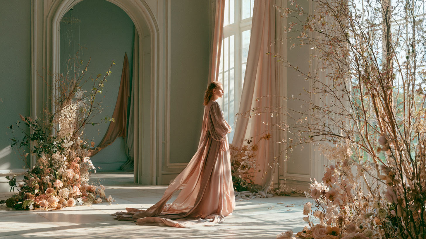
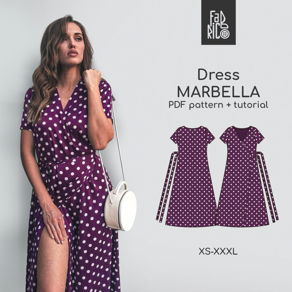
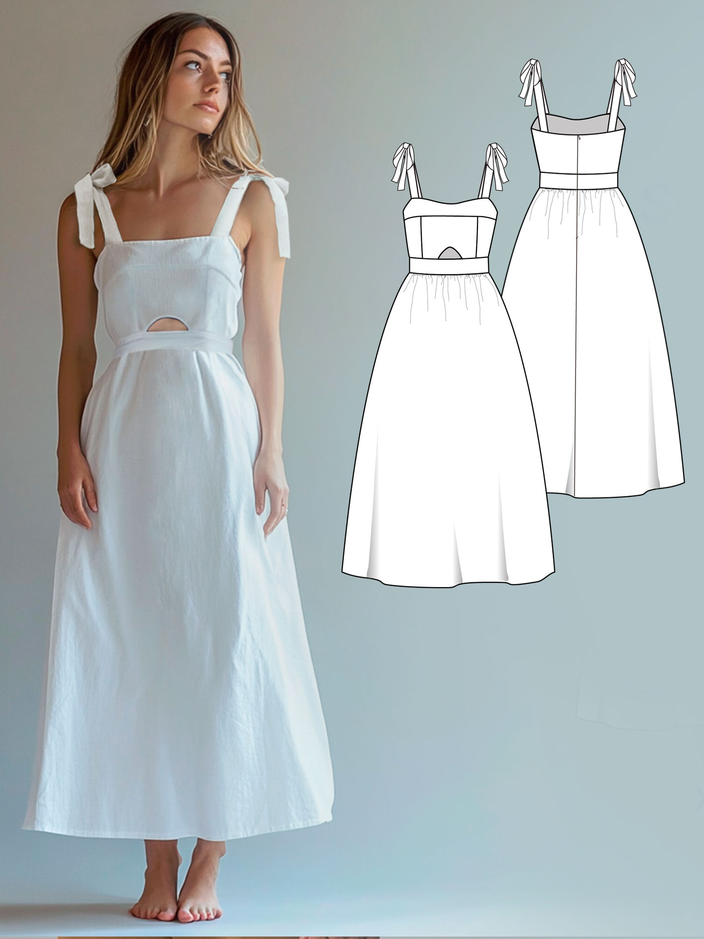
- One colour head to toe creates an unbroken vertical line. A single colour from neckline to hem — particularly in a slightly deeper or muted tone — creates the longest, most streamlined visual impression. This is why a single-colour dress in a medium tone is one of the most consistently elegant choices across all body shapes.
Colour Placement by Figure
Understanding the advance/recede principle means you can apply it to any figure, rather than following pre-prescribed rules. Here's how it maps onto different proportions.
Narrower shoulders, fuller hips
Goal: draw visual weight upward, making the upper body more present relative to the lower.
Colour approach: A lighter or more vibrant colour at the top, darker or more muted at the bottom. The lighter top draws the eye upward; the darker skirt recedes and minimises the lower half.
In a dress: Look for patterns with contrasting bodice and skirt, or choose a fabric with a print at the bodice and a plain darker tone for the skirt. Alternatively, a single-coloured dress in a medium tone with a lighter jacket adds visual weight at the shoulders.
Single-fabric option: A medium-to-dark tone in a rich colour (burgundy, forest green, dusty teal) minimises the hips without a strong contrast break.
Broader shoulders, narrower hips
Goal: the opposite — add visual presence to the lower body and reduce weight up top.
Colour approach: Darker, more muted colour at the top; lighter or more patterned fabric at the bottom. The darker top recedes; the lighter or printed skirt adds fullness to the lower half.
In a dress: Skirts with light colours, prints, or texture draw the eye downward. A dark bodice combined with a floral or printed skirt is a classic, effective application of this principle.
Defining the waist
Goal: emphasise the narrowest point of the torso.
Colour approach: Contrast at the waist — through a contrasting belt, a seam where two colours meet, or colour blocking with darker panels at the sides and lighter at the centre (creating the impression of a narrower middle).
In a dress: Wrap and belted dresses naturally create this effect through silhouette. A contrasting belt in a darker colour over a plain dress achieves it through colour alone.
Creating the impression of curves
Goal: suggest definition where the silhouette is naturally fairly uniform.
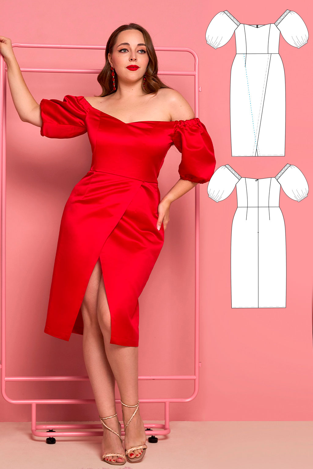
Colour approach: Contrast between bodice and skirt creates a visual waist. A lighter bodice draws the eye up; a darker skirt creates a break that reads as a waist even when the seam sits at the natural waistline.
In a dress: Colour blocking — two distinct colours in upper and lower sections — is the most effective approach. Vertical colour panels (darker at the sides of the bodice, lighter at the centre) create the visual impression of a narrower middle.
Dimension 2 · Undertone
The Colours That Suit You, Specifically
So far this guide has been about how colour placement affects proportions. But there's a separate dimension to choosing flattering colours that has nothing to do with body shape: which colours work with your specific complexion.
This is the territory of colour analysis — a framework that identifies which tones and intensities make a person's skin, hair, and eyes appear brighter, more even, and more alive, and which make them appear dull, tired, or uneven.
The key variable is undertone: the underlying warmth or coolness in your skin. This is distinct from skin depth (how light or dark your skin is) — warm undertones appear in all skin depths, as do cool ones.
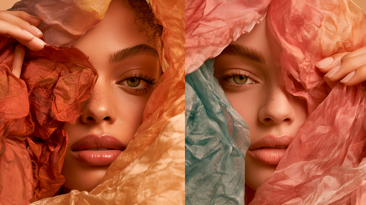
Golden, peachy, honey
Veins look greenish in natural light; gold jewellery looks better than silver. Flattered by warm, earthy colours.
Pink, rosy, bluish
Veins look blue or purple; silver jewellery looks better than gold. Flattered by cool, jewel-like colours.
A balance of both
Veins look bluish-green; both metals work. Most colours flatter — only the most extreme warm or cool versions may look slightly harsh.
- Take the fabric you're considering to a window with natural daylight.
- Remove makeup if you can, and hold the fabric close to your face — under your jawline.
- Watch your reflection. Does your skin look clearer and more even? Eyes brighter? Features more defined? The colour is working with your undertone.
- Does your skin look sallow, grey, or uneven? Features less distinct? The colour is working against it — put it back.
As a home sewist, you have an opportunity most shoppers don't: you can test a fabric in natural light before committing. Thirty seconds saves a dress you never quite feel right in.
Dimension 3 · Contrast
Your Personal Contrast Level
Beyond undertone, there's a third variable that affects how different colours look on different people: personal contrast — the difference in lightness and darkness between your skin, hair, and eyes.
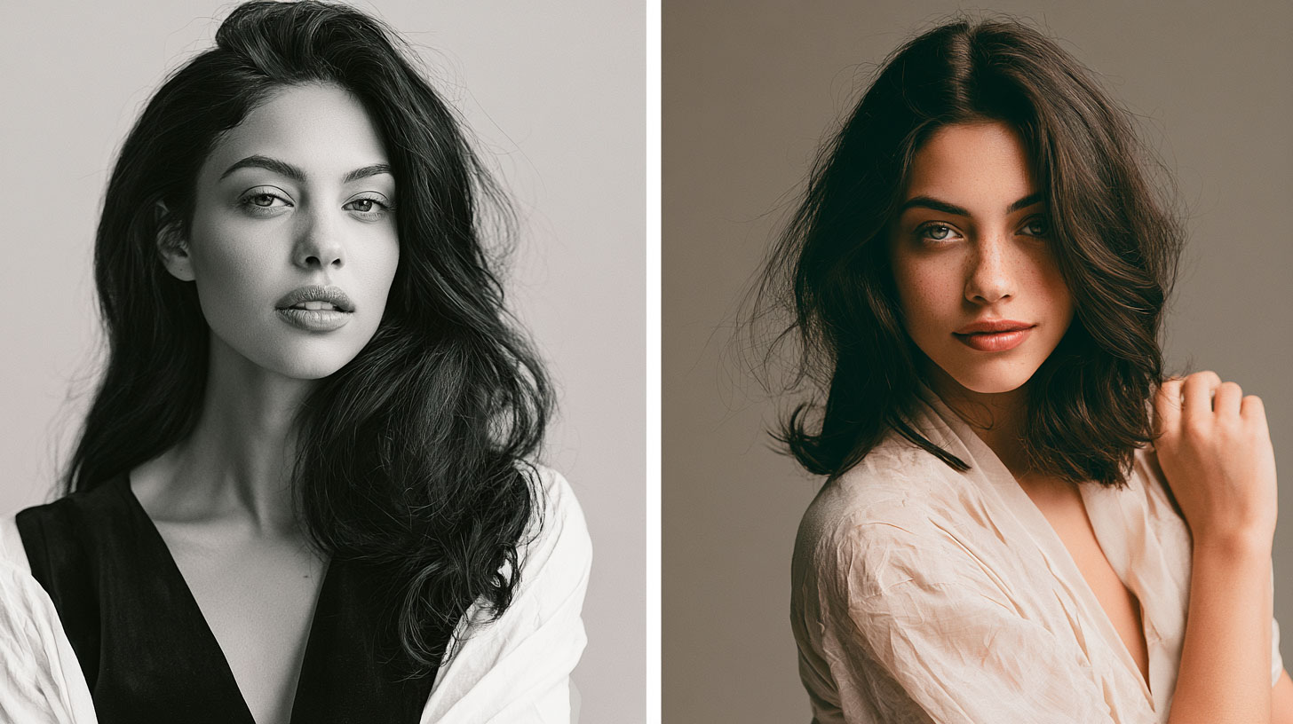
High contrast
Fair skin with very dark hair and eyes — or very dark skin with light eyes. Your natural features are already visually dramatic. You can generally wear high-contrast combinations (white and black, bright red and navy) without either the outfit or your features overwhelming each other.
Low contrast
Medium skin with medium hair and medium eyes, or where skin, hair, and eyes are close in depth. Your natural features are harmonious rather than dramatic. Very high-contrast outfits may overwhelm the face — soft tonal combinations (shades of the same colour, or colours close on the wheel) look more intentional.
This principle applies to prints as well as plain colours: bold, high-contrast prints (black and white florals, strong geometric patterns) work best on high-contrast complexions. Tonal prints — soft florals in similar shades, watercolour-effect patterns — flatter lower contrast complexions.
Putting It Together for Your Handmade Dress
When you're choosing a fabric for a Fabrico pattern, you're making all three decisions simultaneously:
- Placement: Where will the colour sit on the body, and what visual effect do you want it to create? A single colour throughout creates length and unity. Two colours — bodice and skirt — create a waist break. A darker skirt minimises the hips; a lighter bodice emphasises the upper body.
- Undertone: Which colours make your complexion look clear and alive when held close to your face in natural light? Trust this test over any general rule about which colours "should" suit you.
- Contrast: Does the colour match your personal contrast level? A very bold, high-contrast print on a low-contrast complexion can look overwhelming; a very soft, muted colour on a high-contrast complexion can look washed out.
None of these are rules. They're principles — tools for understanding why certain choices work and others don't. Once you understand them, you can use them selectively, experiment with purpose, and occasionally break them entirely because you love a particular colour and want to wear it regardless of the theory. That's a valid and excellent reason too.
Frequently Asked Questions
How does colour affect how my figure looks?
The fundamental principle is that light colours advance and visually enlarge the area they cover, while dark colours recede and minimise it. A light bodice draws attention to the upper body and makes it look more prominent; a dark skirt minimises the hips visually. This isn't a style opinion — it's a visual fact rooted in the physics of how the eye processes reflected light. You can use this principle deliberately to balance your proportions or emphasise the areas you want to highlight.
What colour dress is best for a pear-shaped body?
For a pear-shaped figure (narrower shoulders, fuller hips), the goal is to draw visual weight upward. A lighter or more vibrant colour at the top with a darker or muted tone at the bottom is the classic approach — the lighter bodice draws the eye up, the darker skirt recedes visually. For a single-fabric dress, a medium to dark tone in a rich colour like burgundy, forest green, or dusty teal works well without creating a strong contrast break.
How do I find my skin undertone?
Check three indicators: the visible veins on the underside of your wrist in natural light (greenish veins suggest warm undertones; blue or purple veins suggest cool undertones), which metal jewellery looks better against your skin (gold for warm, silver for cool), and how your skin looks in natural light without makeup. Warm undertones have golden, peachy, or honey notes; cool undertones have pink, rosy, or bluish notes. If you can't tell, you likely have a neutral undertone and can wear both.
What colours suit warm undertones?
Warm undertones are flattered by warm colours: amber, terracotta, warm red, olive green, coral, warm yellow, and camel. These colours echo the gold and peach notes already present in the skin, making it appear brighter and more even. Cool true white can look harsh on warm undertones — cream or ivory is usually more flattering.
What colours suit cool undertones?
Cool undertones are flattered by cool colours: true white, icy pink, cool blue, lavender, emerald green, blue-based red, and charcoal. These colours work in harmony with the pink and blue notes in the skin. Warm yellow and orange can sometimes look heavy on cool undertones — softer, dustier versions tend to be more flattering.
What is personal contrast and why does it matter?
Personal contrast is the difference in lightness and darkness between your skin, hair, and eyes. High contrast (fair skin with very dark hair, or very dark skin with light eyes) means you can wear bold, high-contrast colour combinations without being overwhelmed. Low contrast (skin, hair, and eyes close in depth) is best flattered by softer, tonal colour combinations — different shades of the same colour, or colours close on the colour wheel. Bold high-contrast outfits can overwhelm a low-contrast face.
How do I test if a fabric colour suits me before buying?
Hold the fabric close to your face in natural light, without makeup, and observe. If your skin looks clearer and more even, your eyes appear brighter, and the colour draws attention to your face, the colour is working with your undertone. If your skin looks sallow, grey, or uneven, or if your features appear less defined, the colour is working against it. As a home sewist, you can do this test before committing to a fabric — it takes thirty seconds and can be the difference between a dress you wear constantly and one you never quite feel right in.
Choose your fabric, sew your dress
Keep reading
The Best Colours to Wear in Hot Weather
Why white works, why black is more complicated than you think, and what the research says about staying cool through colour.
Read more
Why Choosing the Right Fabric Matters
The colour you choose interacts with the fabric you choose — here's how to make both decisions well.
Read more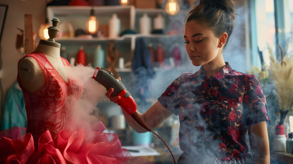
Press to Impress
A crisply pressed seam is what makes a handmade dress look professional — whatever colour you chose.
Read more
Behind the Pattern
What actually goes into the PDF that lands in your inbox — and why a well-graded pattern is worth more than its price tag.
Read more
Thread, Click, Sew.
Free online sewing resources every beginner should know — courses, channels, and communities worth bookmarking.
Read more
Beyond the Seam
From sewing alone to finding your creative community — where to look and what changes when you do.
Read more