
The Best Prints and Patterns for a Summer Dress — and What to Avoid When It's Hot
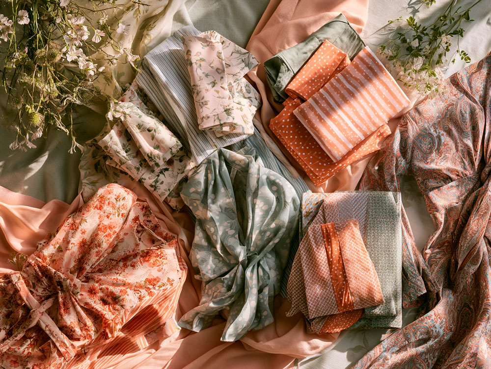
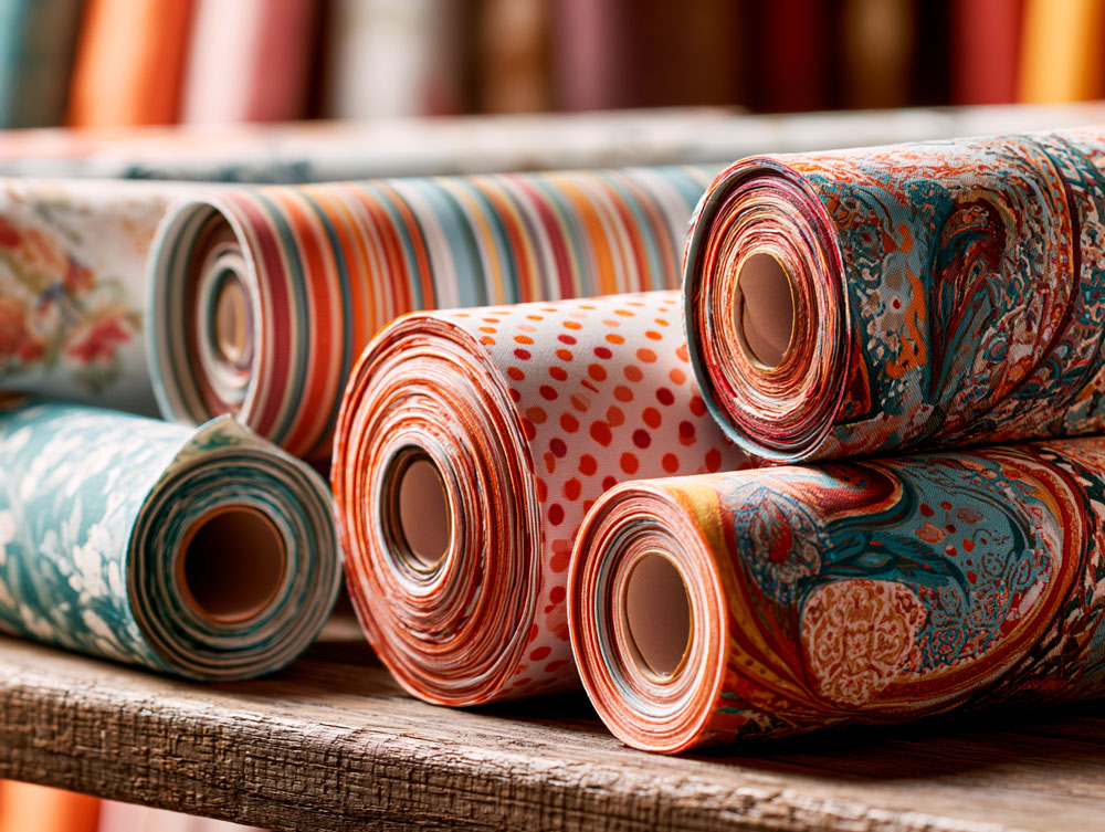
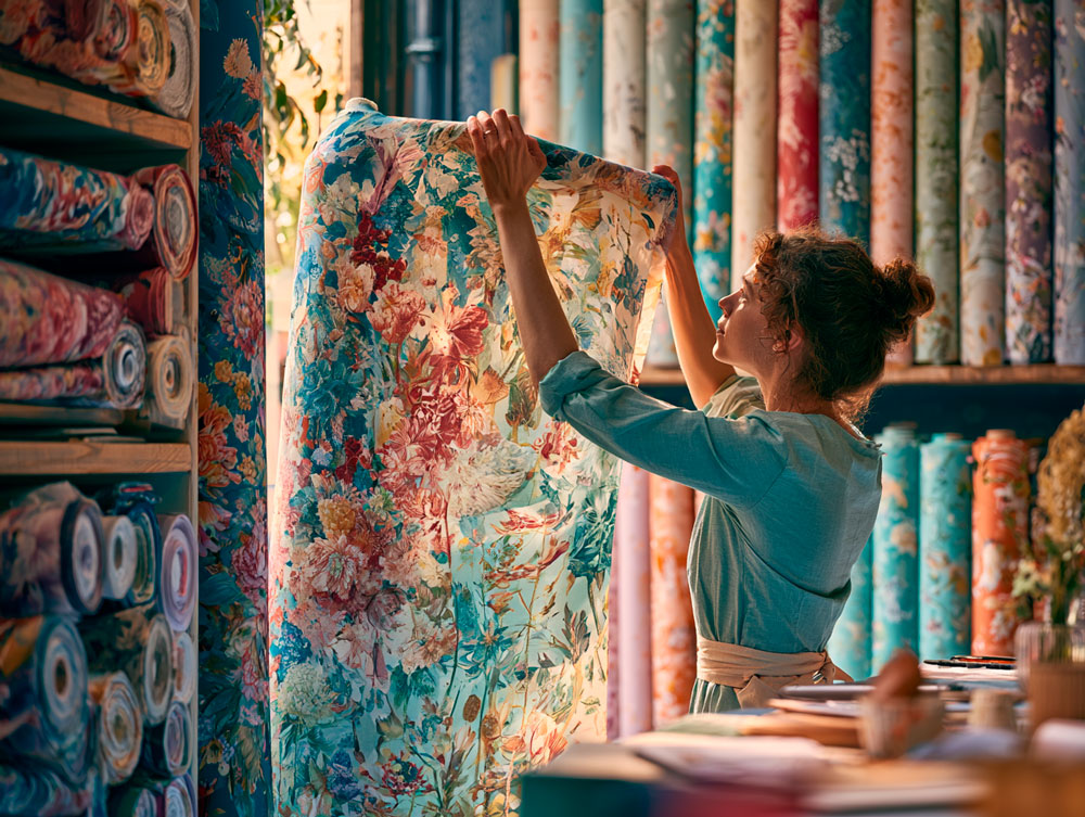
Walk into any fabric shop in May or June and you'll find yourself facing a wall of options: florals in every scale, geometrics in every colour, stripes running in every direction, paisleys, polka dots, abstract prints, checks, and solid colours. All of them are summer fabrics. Not all of them will produce the summer dress you're imagining.
Choosing a print for a handmade summer dress involves more decisions than choosing a solid colour — and more opportunities to get something exactly right, or slightly wrong. The print affects how the finished dress reads on the body, how easy it is to cut and match, how it behaves in the heat, and whether it remains a classic choice or feels dated after a single season.
This guide covers the main categories of summer print, what each one does visually and practically, and how to make the choice that will produce the dress you actually want to make and wear.
Medium-scale florals remain the most versatile summer print. Stripes are the most directional — vertical lengthens, horizontal widens. Polka dots and geometrics have both had strong fashion moments in 2025-26, with geometrics being the most beginner-friendly to cut. Paisleys return with the boho revival. For hot weather, choose lighter backgrounds; for easier sewing, choose abstract repeats over directional ones. The best print is the one you'll still love in three years.
Five Print Categories, at a Glance
If you're scanning rather than reading, here's the whole guide in one table.
| Visual character | Best for | Ease of cutting | |
|---|---|---|---|
| Florals | Classic, feminine, varies by scale | Most figures, most occasions | Medium (large floral = harder) |
| Stripes | Strongly directional | Lengthening (vertical), widening (horizontal) | Medium (chevron = hardest) |
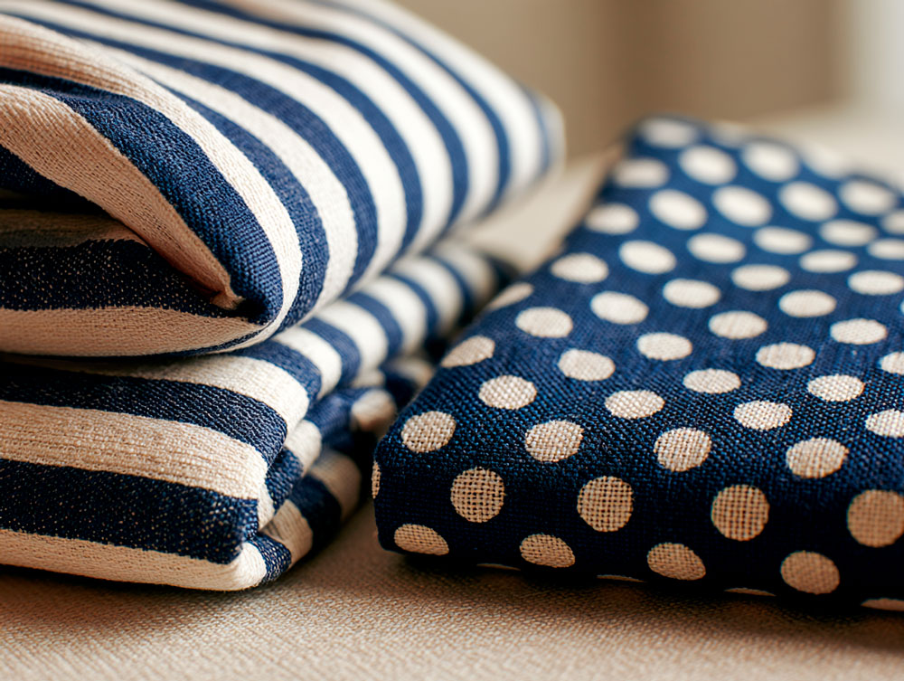
| Polka dots | Playful, graphic | Day or evening; classic look | Easy |
| Geometrics | Contemporary, structured | Modern silhouettes | Easy (especially abstract) |
| Paisleys & botanicals | Bohemian, flowing | Maxi dresses, viscose, lawn | Medium |
The Summer Classic, Done Well
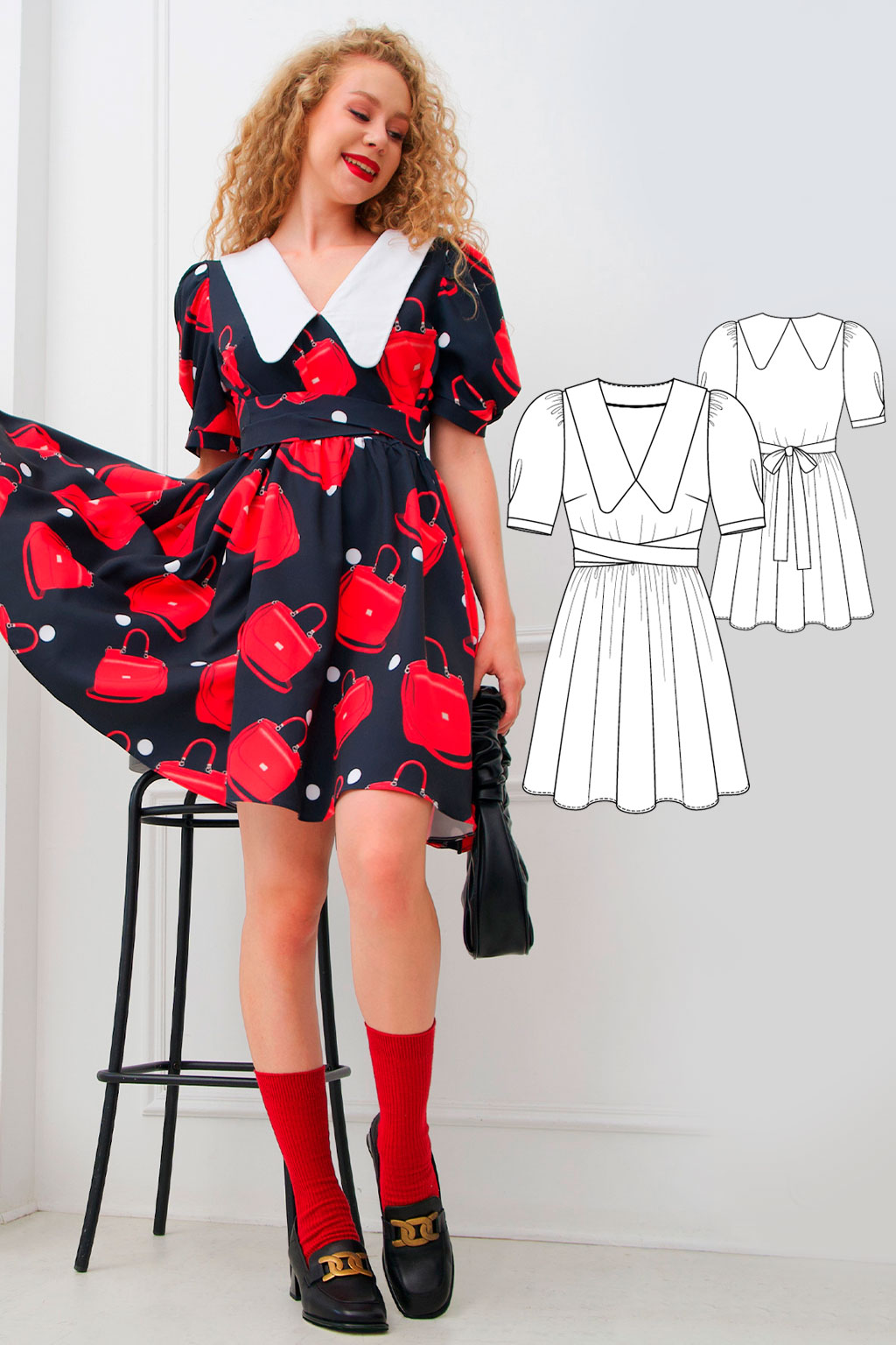
Floral prints are the definition of summer dressing — they have been since the 1930s, and they will be long after any other current trend has cycled through. But not all floral prints are equivalent, and the difference between a floral that looks fresh and one that reads as tired often comes down to scale and background colour.
Small / ditsy
Sweet and delicate in the hand, but can become visually busy on a larger body or full skirt. Beautiful on a smaller frame or a fitted silhouette.
Medium (5–10cm)
The most versatile and consistently flattering scale. Reads clearly at a distance without overwhelming. Suits most figures and styles.
Large / maximalist
Bold and high-impact. Requires more fabric (for pattern matching) and a simple silhouette where the print itself is the design statement.
Background colour matters as much as the flowers. A dark-background floral (flowers on navy, forest green, black, or deep burgundy) reads as sophisticated and evening-appropriate. A light-background floral (flowers on white, cream, or pale blue) reads as fresh, summery, and day-appropriate. For a party dress, consider whether you want the formality of a dark background or the brightness of a light one — both are beautiful, but they produce different occasions.
The Most Directional Print
Stripes are one of the most useful prints in fashion because they do something few other prints can: they create a clear directional line that the eye follows, and changing the direction changes the visual effect on the body.
- Vertical stripes draw the eye up and down, creating the impression of height and length. On a dress with a centre front seam or panel, vertical stripes run uninterrupted from neckline to hem — particularly flattering for petite figures and for any figure wanting a streamlined silhouette.
- Horizontal stripes draw the eye across the body, widening the visual impression of the area they cover. Not inherently negative — used deliberately, horizontal stripes at the shoulders add width to narrow shoulders; at the bust, they add visual presence; at the hip, they broaden narrower hips. The key is where the stripe sits relative to the areas you want to emphasise.
- Diagonal or chevron stripes create movement without the strong directional pull of vertical or horizontal lines. They're also one of the most technically demanding prints to cut, because the stripes need to be matched at every seam — requiring extra fabric and careful cutting.
Narrow
Pinstripe or fine Breton — reads as refined and classic.
Medium
The most versatile — readable at a distance without dominating.
Wide / high-contrast
Bold and graphic — best on simple silhouettes where the print is the design statement.
Perennially Relevant
Polka dots have been a summer staple since the 1950s and show no sign of retreating. In spring 2026, designers including Dries Van Noten brought them back in both delicate, sheer versions and high-contrast, bold iterations — suggesting that polka dots in 2026 are as current as any other print option.
The visual logic of polka dots is similar to florals: scale and spacing determine the overall effect. Small, closely spaced dots read as a tone rather than a print from a distance — subtle and versatile. Medium dots with visible spacing are the classic polka dot — playful and recognisable, particularly flattering in monochrome versions (white on navy, navy on white) where the contrast creates a crisp, graphic impression. Large dots are bold and graphic, best on simple silhouettes.
Colour contrast between dot and background determines how dramatic the print reads. High contrast (black on white) is the most graphic and bold. Low contrast (navy on blue, cream on white) is subtle and tonal, and reads almost as a texture rather than a pattern.
Geometric & AbstractThe Contemporary Choice
Geometric prints — triangles, squares, diamonds, abstract shapes, colour blocks — are the print category that moves most with current trends, and for 2025 and 2026 they're very much in the mainstream. Designers favour futuristic and tech-inspired patterns, with geometric shapes in metallic shades and abstract mosaics creating prints that add optical depth.
For a home sewist, geometric prints have a practical advantage over florals: they typically don't need to be matched at seams in the same way that a clearly patterned floral does, which makes cutting and construction easier.
- Abstract prints — where the pattern has no clear repeat or directional element — are the most forgiving to cut and the easiest to work with for a first printed-fabric project. The fabric can be cut in almost any direction without creating a visible mismatch.
- Geometric repeats (regular patterns of diamonds, hexagons, squares) do need some attention to matching, particularly at centre front and back seams, but are considerably less demanding than large florals.
The Boho Choice
Paisley — the teardrop-shaped swirling motif with roots in Persian and Indian textiles — has returned to mainstream fashion in 2025 and 2026 alongside the broader revival of bohemian style. Romantic florals, paisleys, and boho prints signal the return of a free-spirited aesthetic that pairs well with flowing silhouettes, natural fabrics, and the kind of relaxed ease that summer dresses at their best embody.
Paisleys and botanical prints (hand-drawn florals, tropical foliage, exotic plant motifs) work particularly well in viscose and cotton lawn — fabrics that move and flow — and in mid-scale where the detail of the print is visible without overwhelming the garment.
Prints to Approach Carefully in Hot Weather
Two categories of print deserve a specific mention in the context of hot-weather dressing.
Very dark-background prints — deep navy, black, or dark green as the primary ground — will absorb more heat in direct sun than lighter-background equivalents. If you're primarily sewing for outdoor summer wear, consider whether a lighter version of the same print (the same florals on a cream or pale blue background) would serve you better in the heat.
Very busy, high-contrast prints — multiple colours, complex pattern, strong contrast — can feel visually overwhelming in hot, bright conditions where everything is already vying for attention. There's a reason that the most enduringly popular summer prints tend to be relatively simple in their colour relationship: two or three colours, clear motifs, sufficient background between elements. Not a rule, but a tendency worth noting when you're standing in the fabric shop deciding between the bold print and the simpler one.
A Quick Decision Framework
When you're holding a fabric in the shop and trying to decide:
- Hold it at arm's length. A print that reads beautifully from 50cm away in the hand will read beautifully on the body. A print only interesting up close will disappear at the distance most people see you.
- Check the repeat length. A print with a 30cm repeat on a dress requiring a 150cm skirt needs enough extra fabric to align the repeat at each piece. Ask in the shop if you're unsure.
- Consider what the background colour will do in the heat. Pale backgrounds stay cooler; dark backgrounds absorb more heat. For outdoor summer wear, lighter is more comfortable.
- Think about your silhouette. A maximalist print is most beautiful on a simple silhouette. A simple print can carry a more complex construction. If your pattern has interesting construction — pin tucks, gathered details, structured panels — a simpler print (or solid) will let those details read clearly.
- Choose a print you'll still love in three years. Trend-driven prints date faster than classics. A well-chosen floral, a clean stripe, or a polka dot will still look right next summer.
The most enduring summer prints share something quiet in common: two or three colours, clear motifs, sufficient background between elements. You'll still love it next year.
Frequently Asked Questions
What is the best print for a summer dress?
Medium-scale florals (flowers in the 5–10cm range) are the most versatile and consistently flattering print for a summer dress. They have enough visual presence to read clearly at a distance without overwhelming the silhouette, suit most figure types and most dress styles, and have remained classic since the 1930s. For a hot-weather summer dress specifically, choose a floral on a light background (cream, white, pale blue) rather than dark — it stays cooler in direct sun.
Do vertical stripes really make you look taller?
Yes. Vertical stripes draw the eye up and down the body, creating a clear directional line that the eye follows and producing the visual impression of height and length. They're particularly flattering for petite figures and for anyone wanting a streamlined silhouette. The effect works best on dresses with a centre front seam or panel, where the stripes run uninterrupted from neckline to hem.
Are horizontal stripes unflattering?
Not inherently. Horizontal stripes widen the visual impression of the area they cover, which can be used deliberately: at the shoulders they add width to a narrow upper body; at the bust they add visual presence; at the hip they broaden narrower hips. The key is where the stripe sits relative to the areas you want to emphasise or de-emphasise. A horizontal stripe at the bust is flattering for a small bust and less so for a fuller one.
What scale of floral print is most flattering?
Medium-scale florals (flowers in the 5–10cm range) are the most versatile and consistently flattering scale. Small ditsy florals look sweet on smaller frames and fitted silhouettes but can become visually busy on larger bodies or full skirts. Large maximalist florals are bold and high-impact but require more fabric (for pattern matching) and work best on simple silhouettes where the print is the design statement.
How much extra fabric do I need for a print?
It depends on the repeat length of the print. As a rule of thumb, add at least one full repeat of the pattern to the fabric requirement specified in your pattern — and more if the repeat is large or directional. A floral with a 30cm repeat on a 150cm skirt needs enough extra fabric to align the repeat at each pattern piece. Abstract or non-directional prints need much less extra; large-scale florals or chevron stripes need significantly more. Ask in the shop if you're unsure.
Are dark prints OK for summer?
Dark-background prints (floral on navy, black, or deep burgundy) read as sophisticated and evening-appropriate, but they absorb more heat in direct sun than lighter equivalents. For evening or indoor summer occasions, dark prints are beautiful. For outdoor wear in genuine heat, the same print on a cream or pale background will be more comfortable. The same physics that applies to solid colours applies to prints — it's the background colour that determines absorption.
What prints are easiest for a beginner sewist to work with?
Abstract prints with no clear repeat or directional element are the easiest, because the fabric can be cut in almost any direction without creating a visible mismatch. Small ditsy florals are also forgiving, since the small scale makes any misalignment invisible. The hardest prints to cut are large-scale florals with a clear repeat, chevron and diagonal stripes (which need matching at every seam), and any print where a misalignment would be obvious from a distance.
Sew your print dress
Keep reading
The Best Colours to Wear in Hot Weather
Why white works, why black is more complicated than you think, and what the research says about staying cool through colour.
Read more
How to Choose Colours That Flatter Your Figure
Placement, undertone, contrast — the three dimensions of choosing a colour that genuinely flatters.
Read more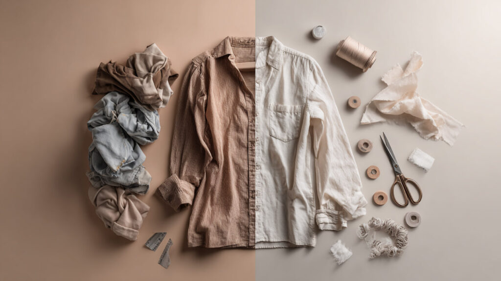
Why Choosing the Right Fabric Matters
The print you choose interacts with the fabric you choose — here's how to make both decisions well.
Read more
Press to Impress
A crisply pressed seam is what makes a print dress look professional — pattern matched or not.
Read more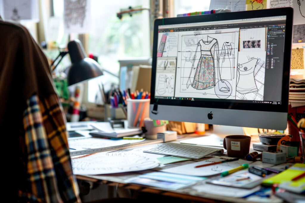
Behind the Pattern
What actually goes into the PDF that lands in your inbox — and why a well-graded pattern is worth more than its price tag.
Read more
Thread, Click, Sew.
Free online sewing resources every beginner should know — courses, channels, and communities worth bookmarking.
Read more